White tile — it’s timeless, classic, affordable and looks good in just about any backsplash, regardless of your kitchen or bathroom’s style or size. Its ability to complement any color palette or material selection means you can choose something that will remain classic and flexible for your home’s future. But what can be done to keep it looking fresh and unique? These kitchens show that a little creativity with arrangement, shape, and grout choice can make all the difference when installing basic white rectangular tiles.
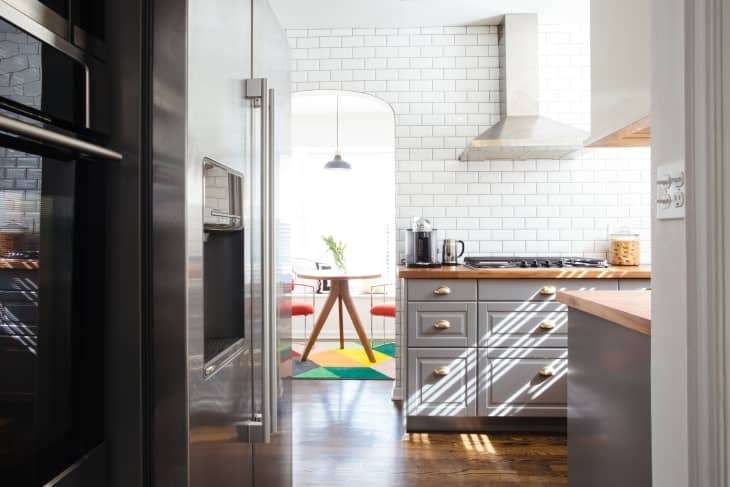
Take it all the way to the top
This home’s kitchen uses classic subway tile literally from floor to ceiling, extending as far as the archway adjacent to the kitchen. The wall is bold and dramatic, yet the space remains bright and calm at the same time.
How to translate this idea in your home: Whatever surface area you were thinking of covering with basic white tiles…go beyond your self-imposed borders. A subway tile backsplash is a bit basic — but a subway tile wall or even entire kitchen is dramatic!
Think out of the box
This kitchen’s application for a standard white tile is to “stack” them one on top of the other, with no “visible” contrasting grout. This look creates an extremely uniform, modern vibe that is simple yet surprising. It’s a subtle detail, but different than what you typically see.
Bonus idea: The sort of “standard” finish of many white tiles is in between glossy and matte. But instead of taking the middle ground, veer slightly into the direction of one end or the other. Installing white tile with a very glossy finish can make a kitchen feel light and airy, and if there’s a window nearby, it can even brighten the space by bouncing some of the natural light in the room.
Play with pattern
There’s something about herringbone that feels expensive. The kitchen above uses classic subway tiles but arranges it in a way that feels new and unexpected. It’s the same with this post’s first kitchen, an image from this London home . Both kitchens use plain white tiles and typical grout, but the way the tiles are arranged gives each room a unique personality.
→ Pick Your Pattern: A Visual Guide to Tile Layouts
Don’t be flat
This Barcelona apartment’s kitchen features a twist on classic subway tile — beveled edge (versus flat). They feel like 3D textured tiles. From a distance, they look just like subway tile, but upon closer inspection, there’s an element of surprise that creates texture, great for any kitchen.
Join the dark (grout) side
Though it comes down to personal choice, there are some benefits to choosing a darker grout in a kitchen backsplash : It highlights the shape of the tile, enhances the look, and helps conceals dirt. The kitchen above’s backsplash feels graphic thanks to dark grout. However, a darker grout comes with its cons , as well.
Be smart with shape
Every other kitchen in this post did a lot with just the humble white subway tile. You can take it to the next level by sticking with white but upgrading the shape, like in the kitchen above with arabesque-shaped tiles or the tiny kitchen with hexagon tiles . Those with tiny budgets but with a strong desire for a different shape can play around with applying tile to a smaller area; the shape gives the tile a bigger visual impact and you’ll save money.
→ 10 Badass Tile Shapes You Didn’t Know Existed

