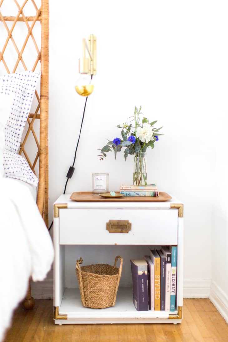
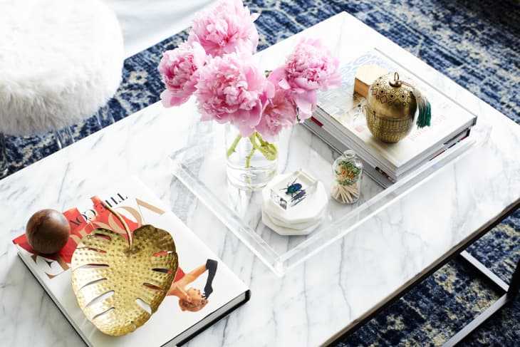
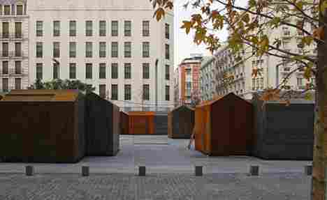
Madrid architectural duo Ben Busche and Isabel Barbas’ recent creations include this stylish, naturally rusted steel plate minimalist kiosk, for use in the Spanish capital’s temporary markets. With the country’s traditional food halls getting the starchitectural treatment – checkout the beautiful Enrique Miralles and Benedetta Tagliabue Santa Catalina Market in Barcelona – it is no surprise that the open markets were quick to follow up in the design game.
When closed, the kiosk resembles abstractly a typical house, with a punched-floral motif, discretely decorated faade. When the front opens up, the toy-like house transforms, revealing a backlit advertising board in the form of an oversized chimney, a brightly coloured interior and the necessary, compact yet functional, shop space.
In December 2006, one hundred kiosks produced by Primur S.A were installed by the city of Madrid throughout three different handicraft markets. Plans to expand the idea with wood and glass variations of the structure, are currently in the pipeline…
Architect: Brut Delux
Shell to Dwell
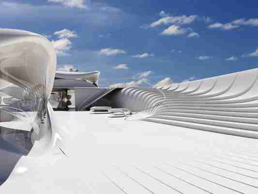
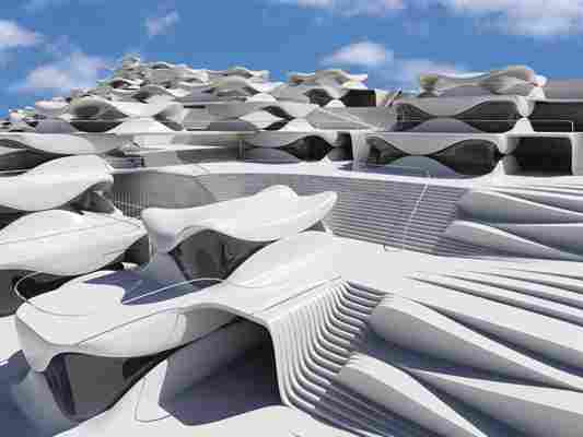
Jerusalem is known for its vertical communities that climb from hillside to hillside. This proposal for the area applies the modernist concept developed in the Bauhaus school in Germany in the 1930’s which is based on five principles, including separation of the walls from the building frame to create a free standing shell. Here the traditional constructive elements become a camouflage for the building frame rather than a part of the structural frame of the building. Take a tour after the jump —>
Designer: Ofir Menachem
Instinctual Architecture
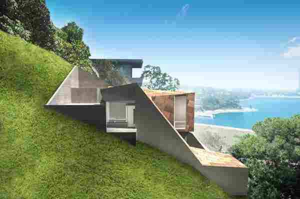
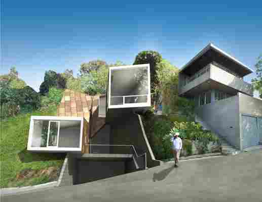
Challenged by a long list of regulations and zoning codes, the Vail House in the hilly Los Angeles neighborhood of Silverlake manages to make the most of the unique terrain and city views. While such challenges often result in drab, boring architecture, Brooks + Scarpa Architects achieves the opposite with this awesomely abstract twisted box that is seemingly a part of rather than “apart from” the natural landscape.
Different than a classically modern approach, where the site conditions and the landscape are perceived as a mere backdrop for the building and remain untouched, this project is in large part directly related to the topography and engages with the landscape, diving into the hill at points and breaking away from it at others. Consequently, the building becomes an abstracted, faceted reading of the landscape that contains it.
Although the building appears to be a direct response to the topography, much of its shape actually derives from a translation of the complex setback and stepback requirements of the hillside ordinances as they relate to this site. The zoning codes require a lower building height towards the street and permitted a taller structure further up the hill. By that means, it was possible to build relatively close to the street and establish a relationship to the smaller scale in the surroundings, while being able to increase the height further back in the lot and thus taking advantage of the spectacular views.
Organized internally through a succession of planes that follow directly the course of the topography, the movement through the building reflects the experience of walking up the hill.
The building volume is created by a simple extrusion of a square, a neutral elongated twisted box that is projected into the site and sculpted along its contours. The folded roof is skewed where directed views or openings are desired.
The building’s movement on the site describes a spiral that begins at a lower point closest to the street, travels up the hill, and then turns back towards the street and the lake, overlooking itself and creating an enclosed court in the center.
This court serves as an entry to the building, covering a parking garage underneath, and is the first in the succession of planes. An 18’ high entrance hall divides the building into its private and public domains and demarks its upper and lower part. From here, the building slopes down to the private realm – the children’s room and the master bedroom, where the continuous, warping space ends in a window that takes up the entire section of the volume. The bathroom, steps up in the other direction, is completely dug into the hill and is lit by a skylight in the patio above. On the other side of the entrance hall, the stair leads up to the kitchen and dining room. A long window towards the hill allows air to circulate through the building from a low window in the living area and provides the necessary cross ventilation. A built-in stand-alone wooden box contains the guest bathroom and defines the transition between the kitchen and the living zone.
An excavation out of the corner of the building at the point where the roof is lifted makes room for a covered patio that can be entered through the dining area. From here, there is access to the back yard, a 15’ wide excavated space that continues the succession of planes from the inside, creating a transition from the interior landscape to the hill.
On the opposite side of the kitchen/dining area, the volume folds away from the hill, moving downwards and again towards the street, when it is dramatically cut off, leaving a framed view overlooking the Silverlake reservoir.
The physical usage of the landscape was not as important as the containment of the building within the landscape, the creation of an artificial landscape inside and the experience of the distant views. The folding of the volume and the openings on its interior facade make it possible to inhabit the space and simultaneously to view it from within.
One of the central questions of this project was how to achieve an economical design on a site that was almost impossible to build upon. An early scheme, a serene, two-story building that maintained the same absolute height throughout and established no relationship to the landscape, proved to be uneconomical because it required huge retaining walls. It became necessary to develop a strategy that would keep the retaining walls as low as possible. This was accomplished in the final scheme by adjusting the building height to the topography, using Structural Concrete Insulated Panels (SCIP), a lightweight, easily to assemble system that was more cost-effective to use than cast in place formed concrete walls. Conceptually, the structure was developed as an exo-skeleton against the earth with the inside forms and spaces contained by light gauge cold-rolled steel, which can be folded and penetrated as necessary. The SCIP panel construction provides a R-40 average insulation value for the entire house. In addition the SCIP panels are made from 100% recycled and post consumer foam and have a 50% fly-ash content in the concrete.
The Vail Grant House distinguishes itself from most conventionally developed projects in that it incorporates energy efficient measures that exceed standard practice, optimize building performance, and ensure reduced energy use during all phases of construction and occupancy. The planning and design emerged from close consideration and employment of passive solar design strategies. These strategies include: locating and orienting the building to control solar cooling loads; shaping and orienting the building for exposure to prevailing winds; shaping the building to induce buoyancy for natural ventilation; designing windows to maximize daylighting; shading south facing windows and minimizing west-facing glazing; designing windows to maximize natural ventilation; shaping and planning the interior to enhance daylight and natural air flow distribution.
Furthermore, the building width was intentionally limited to 15’ throughout, reducing spans and simplifying construction. Solar panels placed on the slope behind the house produce enough energy to make this a completely self-sustained building. Small diameter pipes are inserted into the hillside and thru the SCIP panels bringing 60ºC air into the building for natural air-conditioning. The large viewing window also allow the sun to heat the adjacent interior concrete slab creating natural convection that rises up the interior space and is vented at the uppermost portions of the building. This will allow natural airflow for both natural cooling and solar radiant heating. When completed the Vail Grant Residence will be 100% energy independent.
By responding to the visceral aspects of the site, both physical and regulatory, a unique sustainable and economic design was achieved.
Designer: Brooks + Scarpa
