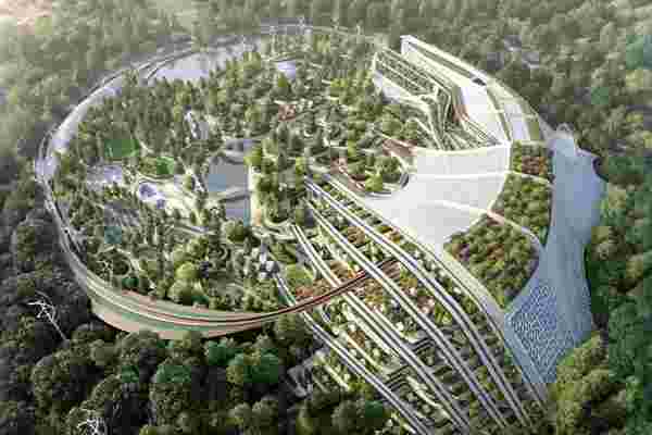
Titled the ‘Garden City of the Crescent Moon’, this eco-urban project by architecture studio Rescubika locates itself on the eastern fringes of Paris within the Bois de Vincennes, the city’s largest public park. Although conceptual for now, the hypothetical project explores how new health, ecological, energy, climate, and sociological challenges will help redefine architecture and urban environments.
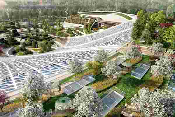
The self-sustaining mini-city is built around the Lac des Minimes, a naturally occurring lake, following its crescent shape and embracing the surrounding islands. Rescubika’s lead architect Benoit Patterlini describes the city as addressing two main themes: Proximity and Instantaneity.
The theme of proximity focuses on self-reliance by putting all aspects needed for sustenance within the boundaries of the city. This meant embracing urban agriculture on a massive scale. “First of all, urban agriculture allows us to produce food within the city”, says Benoit. “Whether it is yards, roofs, or even public spaces, they can be used to produce basic commodities such as corn, beans as well as herbs and spices, etc., and make cattle breeding directly in town, such as dairy production activities.” This would then foster the rise of local shops and markets, bringing citizens closer to their local markets and communities, and allowing all necessary resources to be within ‘proximal distance’ of the residents. On a side note, urban agriculture would also help improve soil quality and reduce air pollution, promoting healthier living.
The idea of instantaneity is ‘purely related to being able to enjoy urban facilities’. A direct result of the proximity built into the city’s design, Rescubika hopes the Garden City’s dwellers will rediscover the notion of time, given that all of the city’s hallmarks, from its offices to houses, recreational spaces, sports complexes, and cultural facilities, are just a heartbeat away from each other.
The fact that the Garden City was envisioned on the outskirts of Paris is very telling. It isn’t just about creating a model city where there’s ample space for construction, it’s also emblematic of a revival, a redefinition of the city as we know it… designed to exist outside of the ‘old city’ area of Paris, both literally and figuratively.
Designer: Benoit Patterlini, Rescubika
Kitchen Designs that become your interior design inspiration!
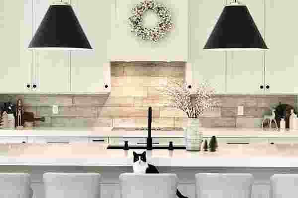
Growing up in a large extended family, gatherings were common and they would all center around the kitchen. Kitchens have always held a special space in my memories, so designing the same needs special attention! The designs we bring to you today are kitchens equipped to handle anything that comes their way! Minimal, modern, colorful, and elegant, we are sure these kitchen designs will match your vibe and inspire you to create your happy space!
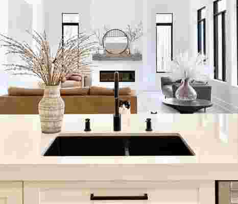
An open-plan kitchen is difficult to merge with the rest of the house while making it stand apart. This kitchen is a part of a house built by a high school sweetheart couple who have detailed their journey of designing their dream house on IG under the page @ahousewebuilt . The underlying theme throughout the interior is a combination of earthy tones with black highlights to create a focal point.
A mix of teal and black accent furnishings with light wooden cabinets gives this kitchen an intriguing mix of retro yet modern feels. Designed by Madeleine , this kitchen is perfect for those who want the best of both worlds!
This modern kitchen design by Edvinas Skiestenis is perfect for our modern homes! Matte black countertops, shelves, and cabinets manage to add a sleek urban feel.
Mysha of @remingtonavenue is an expert at using a mix of wood, metal, and also DIY-ing designs to create a harmonious layout! Each part of her kitchen uses a mix of white and gold without making it overtly feminine with the use of gold burnished metal lamps that balance the space.
Dark yet fresh, that is exactly how I would describe this contrast filled kitchen design by Margaret Naeve Parker. The dark kitchen cabinets make the modern chrome-finish appliances stand out, giving this kitchen a modern look.
I wouldn’t mind whipping up some breakfast in this beach-facing kitchen by Gicinque Cucine ! Minimal cork stools and a wooden kitchen counter are accompanied by breathtaking views of the ocean.
“We wanted it to be open yet connected,” the owner says. “We wanted living to be downstairs and sleeping to be upstairs.” Designer Eric Olsen designed a great room in the middle connects to the kitchen, and a guest suite wraps around the left side. And we can’t help but love the hanging lamps that create a focal point as well as a differentiation between the two spaces.
Man-cave meet kitchen! Leather, hues of copper, and warm accents fill up this kitchen design by Lori Clarke Design. But the focal point of this entire setup is the copper hood that dominates the place while giving the modern kitchen a touch of the antique.
Do you dare to blue? This kitchen is surely inspiring us to go bluer! Designed by Evan Ljunghag, Joshua Coffie of Vigeo Construction the use of blue tiles in the backsplash to create a contrast that makes your kitchen stand apart with ease.
Sometimes we should just let nature do the talking, or in this case, the beautiful wooden countertop with its natural curves should do the talking. PureHaven Homes designed this kitchen with a massive wooden platform that acts as a separator as well as a bar set up in this kitchen that feels perfect for any bachelor pad!
Need the perfect appliances for your newly inspired kitchen? Check out our collection of innovative appliances that will help you unleash your inner chef!
Iconic Logo’s come to life in these architectural designs!
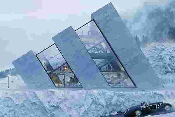
Meet Karina Wiciak of Wamhouse , a Polish designer who has been designing structures based on iconic logos known all over the world! Instantly recognizable because of their inspiration, Karina’s designs utilize negative spacing in the logo to add character and help us imagine how it would be to live in one of these. Looking at them, we can’t wait to see what Karina comes up with more of such brand-worthy designs!
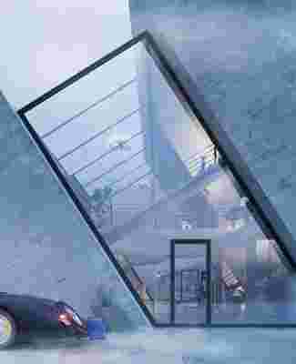
Named as the Trihouse, this conceptual house takes direct inspiration from the Adidas Logo. Now, while this would be an obvious choice for the brand loyalists, the house does hold appeal from a purely aesthetic and architectural point of view. This design is sure to create some interesting corner spaces for the user to work with!
The Ringshouse automatically brings to mind the four companies that combined together to form Audi as we know it today. From afar though they may look like tunnels, the designer, Karina, envisions a pool in the backyard with a view of rolling hills and straw-filled fields in the front of the driveway.
For the love of Chevrolet, meet the bowtie-shaped house named Crosshouse! Imagined as an island, this house stands two-stories tall to be accessed only by a boat, this boat is perfect for the loner who would love to cut off from the surroundings!
Mitsubishi’s three-diamond logo comes to life in this ‘A-shaped’ Pyrahouse! With the glass-fronted windows offering a peek into the interior of the house, the functioning space is visually divided into three individual bits that allow the user to rearrange and match each section to their need.
Rhombhouse encompasses Renault’s diamond-shaped logo! Though the narrow base of the render does make us question the stability of the structure, this house is sure to stand out among the sea of homes we see.

