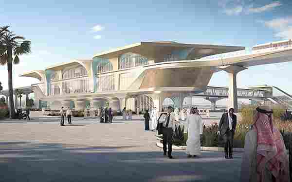
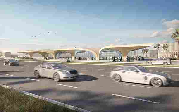
Appointed as the principal architect for the Qatar Integrated Railway Project (QIRP) which will extend to 60 stations, the design forms a bridge between past and future, drawing inspiration from the vast regional architecture lexicon while representing an effective vision of modernism and preservation. With its strong identity, this new network creates instant recognition at busy intersections, serving as a permanent reminder of the alternative to private transportation.
The full network is planned to comprise four lines connecting the GDA as well as Al Khor, and Al Wakrah-Mesaieed communities located north and south of Doha respectively.
SCALES OF IDENTITY: A key concept within the design is one of creating varying scales of identity for the user: network identity, line identity and station identity. Network identity reflects the overall Qatar Rail brand using recurring design elements that will shape the architecture of the stations consistently throughout the network and will offer brand recognition with Doha’s urban fabric. Line identity is achieved by creating different atmospheres within the stations for the theme of each of the metro lines (Historic line, Coastal line, City line and Education line) through distinct wall and floor treatments, as well as through material applications that orient and guide the travellers through their journey. Individual station identity is achieved by displaying features positioned at strategic points in different areas of each station. The content of these features is specific to each station and is related to the local context and/or to the line theme. By integrating curated content throughout the stations, the Metro Network will serve as a cultural vehicle for Doha.
VAULTED SPACES: Building upon existing elements found in the architecture of the region, in the architectural branding vision, the ‘Vault’ represents a new referential bridge between Qatar’s historic architecture and culture and its future as a beacon of innovation and prosperity. Drawing inspiration from the arch, expressions of traditional architecture, the lightness of the dhow sail, and the tensile profiles of nomadic tents, the ‘Vaulted Spaces’ design proposes a contemporary approach to the interpretation and morphological implementation of these elements. Through a system of interconnected triangular base forms, the massing of the geometry adapts and transforms to incorporate programmatic functions and to connect interior spaces with exterior urban infrastructure.
ADAPTABILITY: The scale of the Metro intervention in Doha requires careful planning in order to comply with a strict time schedule and achieve minimum disruption in the urban environment. Flexibility becomes a design and planning objective at all levels of intervention. Using a large catalogue of architectural ‘branding’ elements, the design proposal represents a flexible new architectural system which can adapt itself to the scalar challenges set within the Metro Network. Drawing on innovative construction methodologies and materials, the Qatar Rail architectural identity is designed for an efficient organisation of the production and assembly of elements, resulting in an effective construction site and a high level of quality control.
OYSTER: The materialisation principles are experienced through a duality of a pure, modest exterior versus a rich, illuminated mother of pearl effect interior. The exteriors reference the monolithic strength of old Qatari architecture, while the interior spaces create a radiant effect of movement and fluidity. The use of this uniquely Qatari ornamentation and material palette assists in dividing the large interior spaces and guiding pedestrians towards the transient spaces. The integrated light lines amplify the experience, function as natural wayfinding elements and contribute to a unique ambience for the Metro Network.
CARAVANSERAI: Referencing the notion of Caravanserais – which were inns with enclosed courts that served as gathering and resting places on ancient trade routes – and following in the lineage of historic train palaces, the design generates social interaction and propagates place creation over space creation. Drawing on this tradition of key reference nodes along a travelling route, a sequence of wall attractors within the transient space of pedestrian flows create moments of diversity, opportunities for calmness and gathering and showcases for local culture and identity.
Designer: UNStudio
Modular architectural design that brings a healthy mix of Scandinavian design and sustainability to your home!
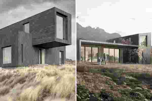
Plant Prefab, a California-based architecture firm that prefabricates sustainable homes, recently collaborated with Koto, a UK-based studio that designs modular homes, to build two residences called LivingHomes. Devised to meet both LEED Platinum and net-zero standards, the homes were also designed and built on some Scandinavian design principles: minimalism and biophilia. Biophilia is the hypothetical human tendency to interact with nature. Biophilic design, which could be inherently minimalist, interprets that human tendency for both interior and exterior spaces, producing a design concept used to increase the connectivity between a building’s residents and the natural world. In order to meet sustainability standards that match Plant Prefab’s mission statement, Koto looked toward Scandinavian design standards. Together they created two LivingHomes, constructed with recycled building materials with respect to the natural world, equipped with ultra-efficient heating and cooling systems, smart energy monitoring, LED lighting, recycled insulation and drywall, and low-flow water fixtures.
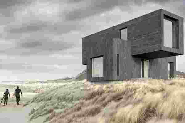
The first home, Yksi, is a cantilevered, two-bedroom residence that employs biophilic design principles through ample deck space and large windows with unobstructed views of natural surroundings. On the first floor of Yksi, which means ‘first’ in Finnish, there are two bedrooms, a bathroom, an office space, and a utility closet. The bedrooms are located on opposite ends of Yksi’s first floor, giving the feel of separate wings for the home’s residents, which enhances the design team’s devotion to Scandinavian design, conveying a sense of quiet luxury. Each bedroom comes with windows that practically take up an entire facade of the two-floor structure. Moving up to the second floor, Yksi is equipped with an open-plan kitchen for excellent cross-ventilation, a dining area, and two separate, outdoor deck areas for easy access to the open air.
The second home, which is named after the Finnish word for ‘courtyard,’ Piha offers four bedrooms and three bedrooms, two courtyards and a deck, and a vast open living space that forms the heart of the home. On the first floor, the open living space incorporates clever use of walls to delineate distinct rooms such as the kitchen and snug, a hideaway just off the main living area. Punctuating the open living area are two courtyards that offer sweeping views of nature and a deck that can be accessed through double-glass sliding doors. Residents can also find two of the four bedrooms on the first floor, once again on opposite ends for prime privacy and quiet, that are separated by a staircase. Following the staircase up to the second floor, residents will find two more bedrooms, one being the master bedroom, complete with an en-suite bath, marked with massive windows for endless views.
Designers: Plant Prefab x Koto
Urban Green Zone
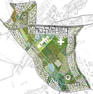
The area on this map, called Madla-Revheim, is the main developmental edge of Stavanger, Norway for which MVRDV and Space Group seek to implement 4000 housing units on the 780 acres site. The sector focuses housing, transportation systems and public spaces around a green center for cultivation and livestock raising. Situated at the point where urban meets rural, the area aims to be one of the first modern models for sustainable growth within metropolitan areas.
Designer: MVRDV & Space Group
