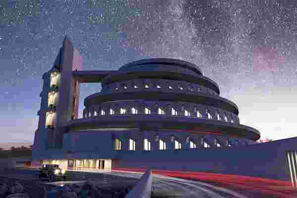
Frank Lloyd Wright is an icon in the design and architecture world. His career spans over 70 years during which he had 532 completed structures and more than 1114 designs that continue to inspire creators even today. In fact, it is his unfinished concept designs that spark more imagination and Spanish architect, David Romero, has been influenced by just that.
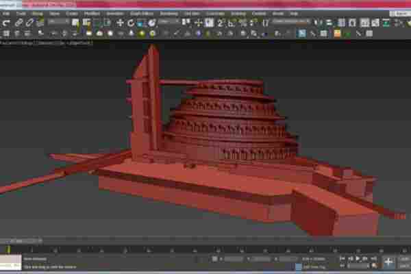
Romero took the 600 designs that Wright left behind and created ultra-realistic 3D renderings of what they would look like today. He even digitally restored some demolished projects. Romero has showcased his art on his website, Hooked on the Past, where he has taken upon himself to complete most of Wright’s unfinished design dreams like the E.A. Smith house, Trinity Chapel, Butterfly Bridge, and the Larkin Administration Building. He uses existing blueprints, plans, elevations, photographs and perspectives from the Frank Lloyd Wright Foundation to guide him as he models structures in AutoCAD and then completing it with finer details using Autodesk 3ds Max.
It is not easy to capture and recreate Wright’s work because most of the plans are from a high point of view. It is a challenge to imagine it from a perspective of someone standing on the street but Romero has a gift to be able to envision a structure and render it with just bits and pieces of the original blueprint. He added details like picturing the Gordon Strong Automobile Objective at night because it was also meant to serve as a planetarium, so he added stars and electric car trails to the image. His attention to detail is seen in the render as he chose to add era-appropriate cars. Romero successfully creates an emotional connection to a building that the audience has never been to but still relates to because of his precise renderings.
“I would love to model all of Wright’s work, but it is immense,” says architect David Romero, a pure Wright fan. “I do not know if during all my life I will have time.” Romero’s work has gone beyond the architecture community and has become relatable to various digital artists like graphic designers and photographers because his renders are so good that they can be considered as contemporary art. While we are all confined to our homes, Romero’s imaginative skills coupled with Wright’s design visions give us the digital window of escape that we can all use right now.
Designers: David Romero
This tiny home’s prefab, eco-centric design is a modular living space that expands as you need!
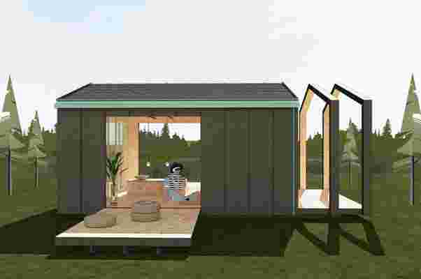
Considering all of the strides sustainable construction has made in recent years, tiny homes have come a long way. Primarily built to cut carbon emissions and other greenhouse gases released during construction work, tiny homes generally come prefabricated without an underground foundation for an overall minimal impact on the environment. Bringing their interpretation into the mix, UOOU Studio, an eco-centric architecture studio, recently unveiled their own tiny home that boasts an energy-efficient and modular design.
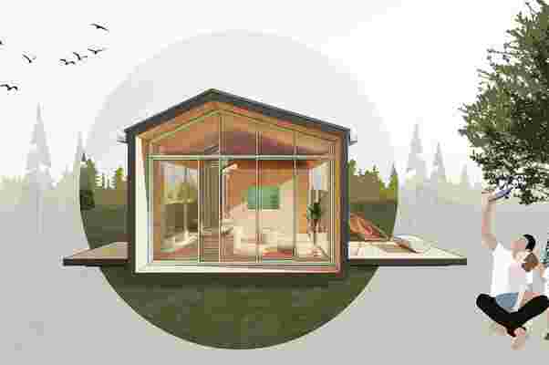
Dubbed Micro Home, UOOU Studio developed the tiny home to be anything from a weekend retreat to a remote office space. Micro Home’s versatility comes through with its convertible roof that incorporates sliding awnings to open and close throughout the day as needed. This means that the space can transform throughout the day from a sunbathing bungalow to a sheltered home office. Micro Home is constructed off site with sustainable building materials like wood and OSB paneling, leaving a low carbon footprint and making it lightweight for easy shipping and handling. After it’s been positioned into place, Micro Home’s roof is tiled with solar panels to generate the home with power. While the building material and solar panels outfit each individual Micro Home, UOOU Studio made it so that owners can customize the interior and overall shape of their Micro Home.
Before the construction process begins, owners are able to choose between a more durable metal cladding and locally sourced wood cladding that gives Micro Home a timeless, more versatile look. Meanwhile, natural OSB panels line the interior walls of Micro Home, giving the inside an organic feel, while the exterior wooden panels can be painted any color the owner chooses. After being positioned into place, Micro Home’s interior is furnished with modular and foldable furniture pieces to optimize the space available. Similarly, Micro Home’s outdoor patio space is created through modular canopies and can be increased by installing additional overhead canopies, reaching 30 feet in extra space.
Designer: UOOU Studio
Architectural designs that focus on humans and nature alike: Part 3
How often did we hear the capitalist’s of the world say “We can’t just stop all our factories and businesses to stop global warming.” Meet the year 2020 and the COVID-19 pandemic that has us all shut down, literally. While we stay at home and flatten the curve, we need to focus on what can we do after this ends. One solution is to promote the trend of green living! Vertical Gardens, urban farms, sustainable housing are the terms the millennials are understanding and living upto. Architectural designs play a major role in promoting them by having the green built into your setup, giving a cool relief to the increasing urban jungle. This curated collection is sure to inspire you to add a small green space in your home, to begin with. After all, slow and steady wins the race against global warming!
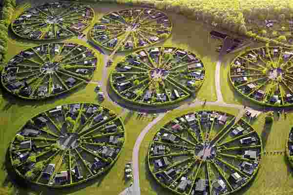
Danish kolonihaver , or “colony gardens” are communal groupings of leisure lots—each complete with a little cabin—that are peppered around the urban and periurban corners of the country. These structures captured by Henry Do show how the colony is not just there to save space or look futuristic, they actually serve a purpose for the citizens of the Dutch capital. They’re similar to allotment gardens, multi-year land rentals in a dedicated area, leased for the express purpose of gardening. When applied for, local residents can rent out the lots if they are looking to grow their own gardens. Due to the way each plot of land is set up, it gives a long vertical area for people to garden, as opposed to regular subdivisions which just provide a very small lengthwise area. Sounds like the perfect summer vacation!
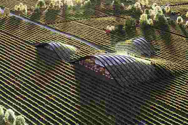
Shilda winery in Kakheti, Georgia by X-Architecture is one of those places where you can literally lose yourself in the surrounding hills! Made to resemble the sloping vineyards, this design provides ample natural lighting to your living space while making the most of your surroundings.
Meet the Villa Vals, designed by Bjarne Mastenbroek and Christian Müller, respectively of the architectural offices SeARCH and CMA. Their design plan was to completely integrate the villa into the landscape to avoid disturbing the unspoiled nature. That is why access to the villa is only possible via the nearby wooden Graubünder shed, through an underground tunnel that runs straight through the mountainside. The façade of the house is slightly slanted, adding to the view of the mountain scenery across the valley opposite the house.
The Faroe Islands , a green country between Norway and Iceland consists of 18 islands spread across the ocean. This place is a remote, peaceful and quiet place with its pristine nature. Pyramid-shaped mountains stripped of long fjords, old churches with roofs covered with grass, lakes, stunning waterfalls and colorful houses in small villages overlooking the ocean. This place has maintained the perfect balance between civilization and nature.
Meet the Dune House by Studio Vural , a seaside holiday dwelling that is carved into sand dunes and operates without relying on public utilities. Using a vast solar field and miniature wind turbines, this house produces more energy than it consumes!
The AMKC House by Dannel Reskala of Sonny Sutanto Architect is proof that green architecture can be modern architecture as well! The wire mesh creates an enclosure for the plants to grow, provide natural lighting while co-existing with the urban environment.
The hexagonal pyramids on the roof of this museum are now covered in a layer of grass, helping the building settle into its marshland environment in the Netherlands. Rotterdam firm Studio Marco Vermeulen carried out the renovation of the Biesbosch Museum – a building with multiple pitched roofs. The holistic nature of the design minimizes energy consumption, with glazing fitted with heat-resistant glass that eliminates the need for blinds. Meanwhile, the earthworks on the north-western side and the green roof serve as additional insulation and a heat buffer.
Designed by Singapore studio Chang Architects , this home was created to accommodate a multi-generation family with space for future additions if the children marry. The concept behind the project looks to enhance livings spaces within a tropical climate through the implementation of well-designed communal spaces, connecting family members. The design creates a tropical haven, bringing greenery and light into every space. An abundance of greenery is also implemented at every opportunity, creating a house that directly connects to nature and brings a certain vibrancy to the indoor and outdoor spaces. With the central pool space framed by cascading planters and green stepped decks, the overall planning is to have passive cooling to create a healthier living environment.
MVRDV’s design for Valley emphasizes the contrast between the corporate history and the more residential future of the Zuidas. Its offices boast high floor-to-ceiling windows, large, brightly lit floorplates and full-service amenities. The residential levels have large openable windows and sliding doors for outdoor spaces integrated within the stone facades. Outdoor ceilings and terraces are clad in natural stone as well, as are the fixed, automatically hydrated planters of varying heights that facilitate Valley’s distinct green appearance. Full glass railings protect residents against wind and sound without impeding on their panoramic views.
Houses in rural Vietnam are planned around common spaces like gardens, ponds, lakes where people connect together. In urban areas, there is a lack of community spaces affecting the users and their connectivity with each other. Ho Khue Architects designed the main concept of the structure from terraced fields. The units are stacked on each other with stepped terraces which provides plenty of light to the apartment units. On the inner sides, atriums are provided so as to get natural light and air ventilation.
Reality is stranger than fiction they say. Not sure about being stranger but it surely is more environment friendly in this case! Hobbiton in New Zealand lets you go visit and even stay in the shire.
For more such exciting and sustainable designs, check out Part 1 and Part 2 of this series!


