{"title":"The Arc at Green School by IBUKU","author_name":"IBUKU","author_url":"https://www.youtubeom/channel/UC52l1G6d8oW9rIsmRu1Xh5g","type":"video","height":"591","width":"1050","version":"1.0","provider_name":"YouTube","provider_url":"https://www.youtubeom/","thumbnail_height":"360","thumbnail_width":"480","thumbnail_url":"https://i.ytimgom/vi/_H7UjJJBl9E/hqdefault.jpg","html":"<iframe width="1050" height="591" src="https://www.youtubeom/embed/_H7UjJJBl9E?feature=oembed" frameborder="0" allow="accelerometer; autoplay; clipboard-write; encrypted-media; gyroscope; picture-in-picture" allowfullscreen></iframe>","arve_cachetime":"2021-07-29 10:10:14","arve_url":"https://youtu.be/_H7UjJJBl9E","arve_srcset":"https://i.ytimgom/vi/_H7UjJJBl9E/mqdefault.jpg 320w, https://i.ytimgom/vi/_H7UjJJBl9E/hqdefault.jpg 480w, https://i.ytimgom/vi/_H7UjJJBl9E/sddefault.jpg 640w, https://i.ytimgom/vi/_H7UjJJBl9E/maxresdefault.jpg 1280w"}
Bamboo-based architecture is common in Bali, but even then the Arc gymnasium by Ibuku is a feat unlike any other in the world of sustainable architecture! The structure has been designed for a private school campus featuring a complex double-curved roof made entirely from bamboo. The Green School has a 12-year history of pushing boundaries and pioneering for sustainable education and Arc is the first of its kind!
Designer: Ibuku
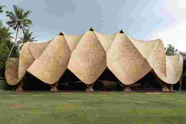
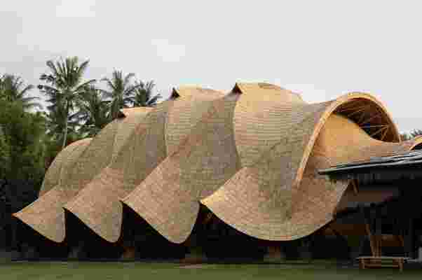
The bamboo structure is built from a series of intersecting 14-meter tall bamboo arches spanning 19 meters, interconnected by anticlastic gridshells which derive their strength from curving in two opposite directions. It employs one of nature’s greatest strategies for creating large spaces with minimal founding pillars. For example, in a human ribcage, there are a series of ribs working in compression are held in place by a tensioned flexible layer of muscle and skin. This creates a thin but strong encasement for the lungs. Similarly in Arc, arches working in compression are held in place by tensioned anticlastic gridshells. These fields of gridshells appear to drape across the spaces between impossibly thin arches soaring overhead and although the gridshells appear to hang from the arches, they actually hold them up.
Its unique shape forms a protective roof sheltering a multipurpose sports court with a floor area of 760 square meters. The lightweight building’s geometry brings the structure into a state of equilibrium, which means a dramatically decreased necessity for structural material. This also means an unprecedented inner volume with an impossibly thin structure and without any distracting trusses. The Arc is truly a magnificent, minimal, and organic structure that shows we can dream big, make an impact, and strive to be more sustainable on a grand scale without compromising on our purpose.
“The concept structure for The Arc is totally unprecedented,” claimed Ibuku project architect Rowland Sauls. “Embarking on a design never before executed required some bravery and optimism. We were creative and stubborn enough to research and develop the answers needed for the success of the project.”
“The gridshells use shape stiffness to form the roof enclosure and provide buckling resistance to the parabolic arches,” said Atelier One director, Neil Thomas. “The two systems together create a unique and highly efficient structure,” he added, “able to flex under load allowing the structure to redistribute weight, easing localised forces on the arches.”
The Biggest J in the World
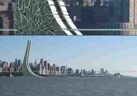
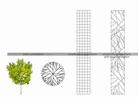
From the expansive designer mind of Meryem Ozturkoglu comes this structure which will one day sit on the SE side (NY side) of the Hudson River, and will also stand as base for a giant walkbridge that connects Central Park and Hudson Park. This design, dubbed CITY-PARK, aims to create a pattern of parks in the city, as visible and as essential to the identity of the city as its skyline of business-oriented towers.
Our friend M.Ozturkoglu calls upon the words of Kevin Lynch from his book The Image of The City , saying thus:
When you plan on constructing a giant tower which sits base to a super-extensive walk-bridge, you’d darn-well better be prepared to take on the city for years to get it approved, for you’re altering its aesthetic, its identity, and its appeal. No matter how nicely you set everything inside a mega-structure, no matter the community appeal, you must take on primarily the look of the entire city – as seen by the rest of the world.
Meryem is right to consider the environment first, as this subject will dominate the project throughout its entire existence. That said, I’d love to skate it someday.
P.S. If you are confused by the preview pic : it’s an illusion. There’s only one tower in this project, I just took a close-up and put it over the far-away. Detail, pan-out. That’s what’s up.
Designer: Meryem Ozturkoglu
3D architectural renders versus real designs that will inspire you
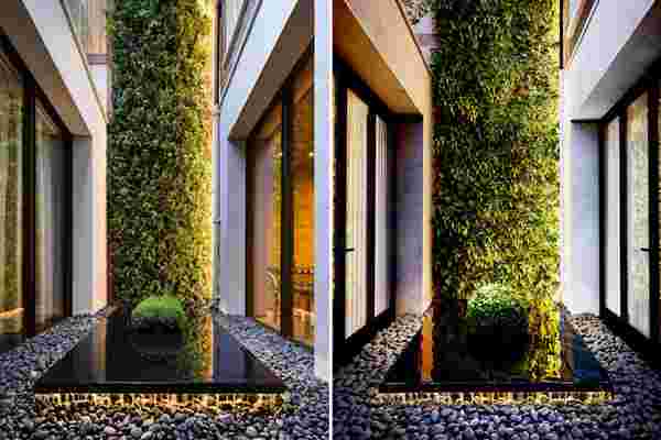
3D rendered designs are everywhere – right from movies to real-life settings, we have reached a time where it is almost impossible to distinguish between render and the real image of a place. Take for example the image here – on asking, most people prefer the image on the right, which may surprise you to know is a 3D render and not an actual image of the Living Wall, present in a home in Belgravia created by Biotecture.
What sorcery is this you ask? Meet Adrian Lobo , popular on Instagram by his company handle @a3render , a 3D visualization powerhouse working from Mexico whose skills have given a new life to this private garden. Using a mix of SketchUp, V-Ray, Revit, 3ds Max and more, the team specializes in creating realistic 3D visualizations of any given space. Scroll through to see more work by this dynamic team that will leave you in awe!
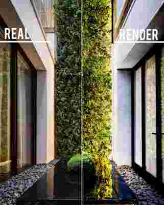
Below is the real architectural design – The Living Wall created for a private garden in Belgravia by Biotecture.
And this is the 3D render visualization by A3 Render.
The render captures the beautiful pebbles laid at the base with a yellow light that gives a warm, inviting contrast with white light streaming in from those sliding windows. An added spotlight from the top illuminates the entire structure.
Impressed? So are we. Here is some more great work by the A3 Render’s team for you to ogle and get inspired by!
Project Tulum House interior focuses on muted interiors with metallic accents to give the room a highlight.
Project Houston Maeva utilizes a splash of neon pink to create a focal point in the room.
The designer visualizes a chair and its fabric with great attention to detail that wows us!
Tons of natural lighting lights up the render of this Project named Restaurant Hacienda Centro.
Our friendly neighborhood Starbucks could surely use this interesting, inviting piece to entice us along with that heady aroma of fresh coffee!
The team at A3 Render sure loves adding a splash of retro with neon lighting and we love it too as seen in their Project Chroma.
The Project Colorado Springs showcases a raw concrete structure nestled between the surrounding hills. I’m sure this house will have some spectacular views of the mountain and the valley.
Marble, in both dark and light shades dominate the Bocce Restaurant.
The Puebla’s Cabin is a perfect mix of modern and rustic getaway for those who want a break from the cityscapes.


